
Appearance
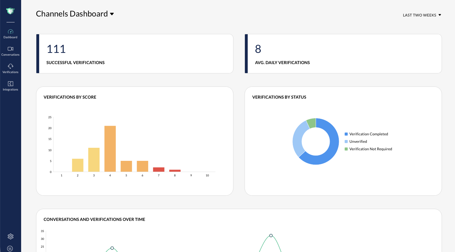
The **Channels **** Dashboard **shows organization-wide verification and conversation activity across all protected collaboration platforms.
At the top of the **Dashboard **, imper.ai displays two key metrics:
Successful Verifications: The total number of completed verifications during the selected time range.
Average Daily Verifications : The average number of verifications completed each day within the time frame. Time Range Selector: Use the dropdown on the right to switch between:
Last Week
Last Two Weeks
All dashboard visuals update automatically when you change the time range.
Risks
The **Risks **section summarizes the verification outcomes that imper.ai has observed recently. It includes two charts:
- **Verifications by Score **A bar chart showing how many verifications fall into each risk level. Risk scores range from **0–10 **, where higher scores indicate higher confidence of possible impersonation or anomalies. You can hover over each bar to view the exact count.
- **Verifications by Status **A donut chart showing the distribution of verification outcomes (Passed,Failed,Timed *Out, orNot **Enough **Questions)*, for example:
- Verification Completed - Verification Bypassed
This helps admins understand whether participants are completing verification flows or attempting to bypass them.
Conversations
The Conversations section visualizes how communication activity and verification behavior intersect over time. 1. Conversations and Verifications Over Time
A combined timeline showing:
- **Verified activity **(bar)
- **Conversations **(line)
Use this to identify patterns such as spikes in meetings or increased verification events on specific days.
2. Conversations by Participants
A donut chart showing the breakdown of conversations by participant type:
- **Internal **(within your organization)
- **External **(outside your domain)
This helps track how much exposure your organization has to external participants - often where impersonation risk is highest.
3. Conversations by Type
A donut chart categorizing conversations by session type.
For example:
- External - Internal (if applicable)
Filtering and Interaction
- Hovering over any chart reveals counts and labels.
- Changing the date range at the top automatically refreshes all visualizations.
- No actions are required from users - these charts reflect activity that imper.ai captures continuously in the background.